Introduction
Outreach is an organization dedicated to helping churches reach
their constituents. They sell religious themed postcards, banners, posters, and movies to
help churches reach out to their congregations.
I was contracted to redesign the
product pages for Postcards, design a mobile friendly menu, and streamline the checkout process.
Discovery
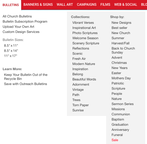
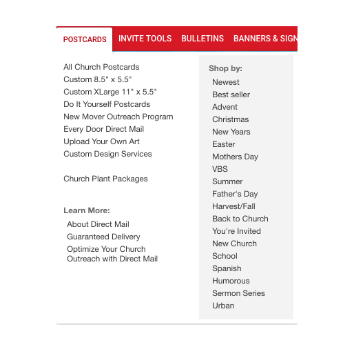
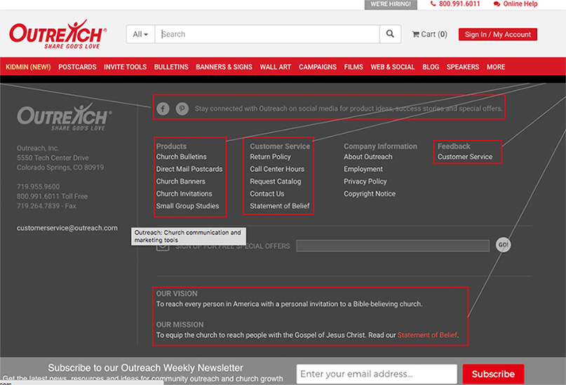
Navigating Outreach.com is a visually overstimulating, reminicent of 90's mailers from your local grocery stores. There are redundancies on the home page and the navigational experience is inconsistent.
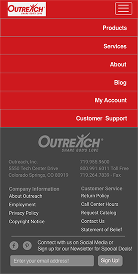
Overwhelming Landing Page
Matters become worse once you visit on mobile, as the design layout of the navigation responsively adjusts, but the amount of subcategories does not, creating gigantic menus that are impossible to navigate on mobile.
Heuristic Analysis
While cataloguing the navigation and site map, I discovered that there isn't a consistent
click path flow between products. When a user navigates to postcards vs. banners, for example,
they are brought to different calls to action, which is confusing when figuring out where to go next.
Additionally, some of the product page links navigate you to a page that you aren't expecting,
such as the bold "standard postcards" link that naviages to a page that creates custom postcards.
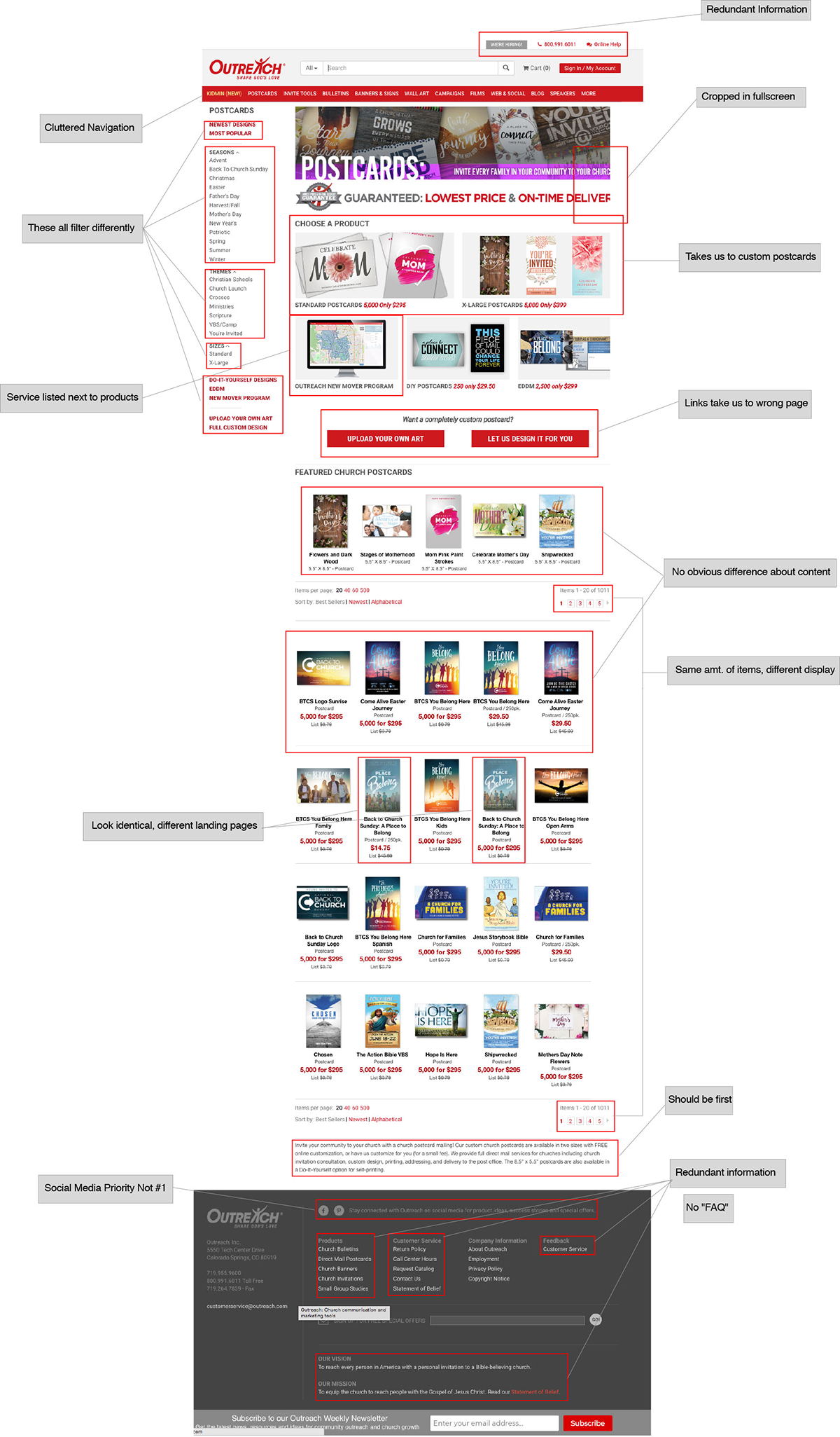
Detailed Heuristic Analysis
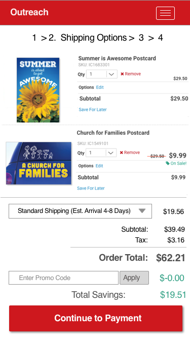
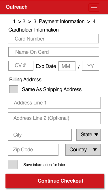
Even if a customer manages to find a product they want, the checkout further impedes the conversion process, with a drop down for shipping options that takes over 3 seconds to load, then forces the entire page to reload when the option is selected, taking 6 seconds or more, simply to update your cart subtotal.
Time Intensive Checkout
Making Changes - Information Architecture
Because the libary of products is so large, I wanted to create levels of categorization to help streamline the search process.
I catalogued every subheading of the navigation and categorized them
into top-level groups, with a goal of maximum 7 items (our magic number based on principles of short-term working memory).
I was able to
reduce navigation menu size from 12 top-level categories
down to 5, and the footer menu from 16 items to 11.
Checkout User Flow
As mentioned above, the actual checkout flow is very cumbersome and required reloading the page every time a new shipping option is selected.
A simple workaround for this would be to offer flat-rate shipping, reducing time to checkout, and increasing convesion.
Takeaways
Ultimately, Outreach suffers from classic decision fatigue, where the user is overloaded with choices and therefore becomes more unlikely to pick any one. The essential functioning of the product pages is established, but the product pages need to be standardized in order to promote effective user navigation and comprehension.
In order to increase conversion, navigation should be streamlined and the checkout process should be as quick and convenient as possible. Products should be able to be found easily, which would be improved with a consistent user flow between the different product pages.