Up to the Challenge
As part of the interview process for a startup, I was given the challenge to create a UI for desktop and mobile that would serve as the access point to finding automotive service, much in the way Yelp finds restaurants.
The requirements for the app were as follows:
- Customer is looking for getting his car repaired within the vicinity of 10 - 15 miles radius (this can be customized by the customer).
- The screen shows all the auto services willing to accept may be in the background
- Filters out the kind of service (say oil change, brakes, tires, transmission fluid, etc) that he is interested in, only those shops display with their ratings, approx estimate and coupons (if valid)
- Customer may choose any of the autoshop he is interested in. Upon opting any one of the autoshop, another screen or may be within the home screen, a short screen pops up with the auto shop profile.
- Customer can call / sms / text / video chat with the autoshop and provide more text details about the job or optionally upload car pic / video.
I began by analyzing other service-finding platforms like Google Maps/Business and Yelp, and thinking about what made them useful. I liked the ratings sytem for both platforms, and both behaved similarly when using the map function to find businesses.

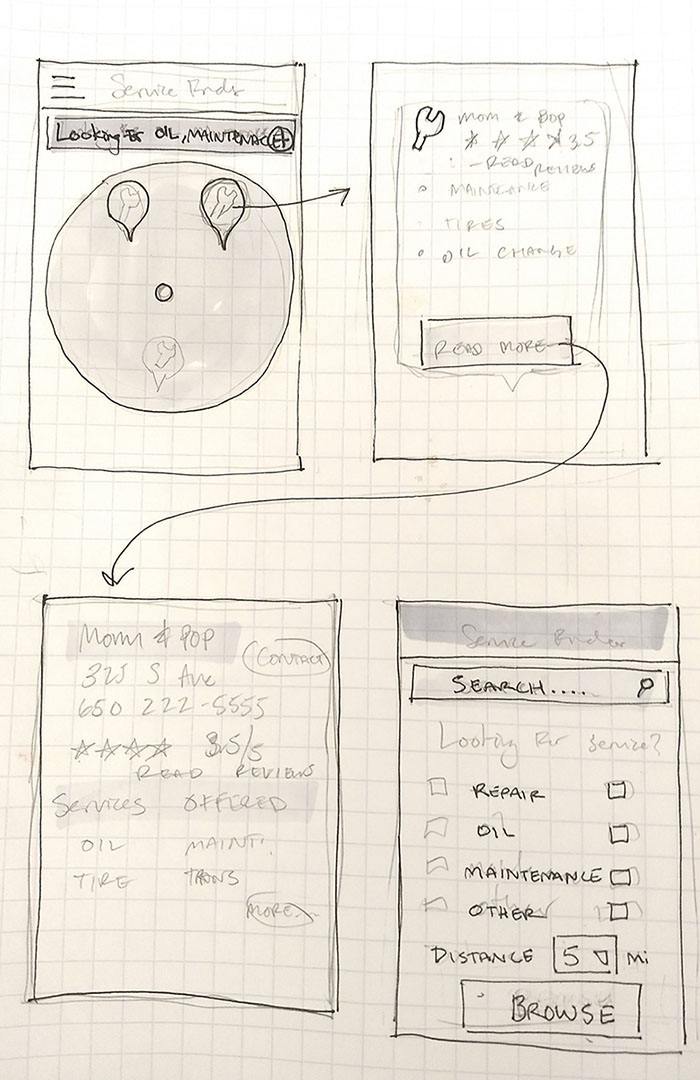
Paper & Pencil Wireframe
I tried to emphasize simplicity in my design, as I know that servicing one's car is a trial in itself, so whatever the platform offered needed to be straightforward and simple. I took what I found and drew up some paper wireframes. Once I had a feel for what I needed to build, I mocked up my concepts with Sketch.
For my final design, I made both mobile and desktop illustrations, drawing from Google Maps and Yelp as inspirations.
I didn't win the challenge, but I gained the valuable experience of more heuristic analysis, tight design deadlines, and building applications for different sized screens.