Introduction
I love Pandora Internet Radio. I mainly use Pandora at home or at work, but rarely in my car.
I realized that most of my mobile usage in the car is in landscape orientation, utilizing navigation, and with the phone at a further distance away than usual.
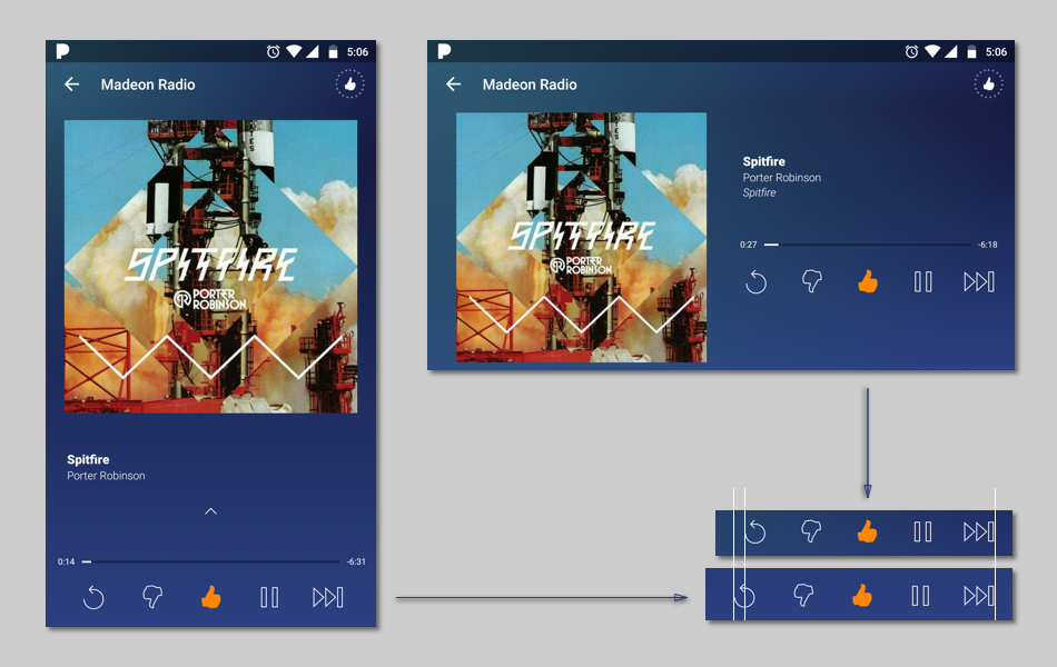
The problem with this is that Pandora's landscape UI is not very useful. It is merely a "fluid" application (rearragement of existing UI elements) of the UI. I believe it would add functionality to the app if the Landscape orientation provided a different interface than the default.
This is a personal case study and design for exploration.
Usability and Heuristic Analysis
My main concern with the landscape layout is that the controls and information are too small to be viewed and used at a distance. Indeed, the size and function of the UI is largely the same in portrait orientation as in landscape. Lists are the same height, and the viewport for selecting new and existing radio stations is able to display fewer than it does in portrait.
The way the phone is being interacted with is important as well. By that, I mean that when used in-car, it is generally suspended on a mount rather than being held in the hand of the user. This is important because cradling the phone grants the ability to anchor your movement, allowing the use of smaller icons. When the phone is in midair, targets that were previously simple to hit become much more difficult.
The standard touch input of smartphones is already extremely sensitive to jostling and bumping. If you've ever tried to adjust the radio while driving, you know that drivers are already prone to making many errors with input due to bumps and distractions. Because the buttons are so close together and small, any jostling in the car will almost certainly result in an incorrect input. To top it off, the control buttons for playback are actually closer together in landscape than in portrait orientation.
Brainstorming Solutions
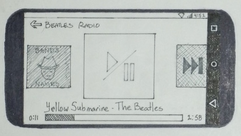
My initial impulse was to increase the button target size, and thus easier to see and touch without causing errors. However, I experienced a touch screen car radio that attempted to use this paradigm and I observed that touchscreen buttons without a physical sense to indicate where the user's hand position is extremely prone to mistakes. There is no tactile feedback for whether what the user is doing has been accomplished or not.
Creating Larger Targets
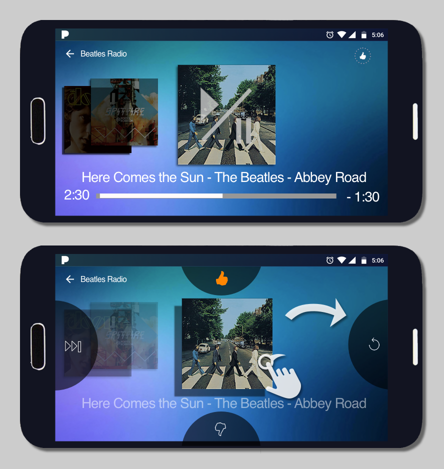
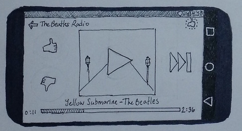
To counter this, I thought that a gestural input would provide a better experience. By adding swipe controls for the main functions, we could turn what was once a micro-movement (movements requiring a high level of accuracy) into a macro-movement, an action that is easily accomplished in an environment where accuracy is not always possible.
Gesture Input Wireframe
Ultimately, the gesture interface seemed like the most effective option to explore for prototyping and testing due to its unlikelyhood for mistaken inputs.
Prototyping
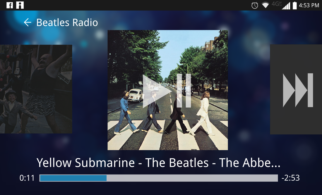
I wanted a type of movement similar to the Facebook Messenger where you drag the bubble to the bottom of the screen to close the on-screen app. Or similar to quick-meet apps like Tinder or Shapr, where you swipe the profile icon to the left or right to indicate whether you'd like to meet someone or not.
As a result, I thought to use the album art as a draggable object that the user would be able to drag into different actions; actions that appear when the user begins to drag the icon.
Next Steps
The next step to this project would be testing a prototype in a real-world environment, preferably mounted on a dashboard in a vehicle. I believe this interface, supported by with a simple onboarding overlay, will provide a superior automotive experience.
