Introduction
Billy Goat Digital is a Denver based agency that provides a platform
on which local businesses can manage their own advertisements.
I was hired to redesign a simple portal that was intuitive for business owners on the go.
Discovery
In order to determine the requirements of the platform, I sat down with the developer to dig into what the requirements for this project were. I found that BGD markets primarily to businesses where the manager is out of the office, meaning the platform had to be simple, fast, and flexible for use on mobile devices.
A Sketch of Mine Saves Time
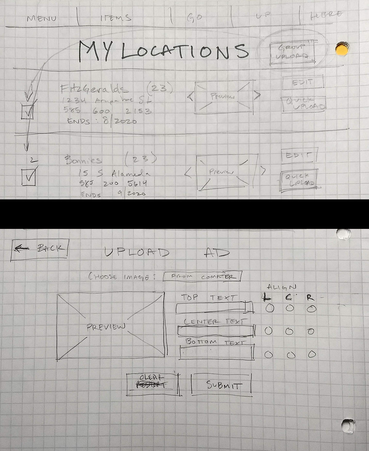
As advanced as computer assisted design has come, I prefer to get things down on paper as pen and paper provides a more responsive and quick method of getting ideas down.
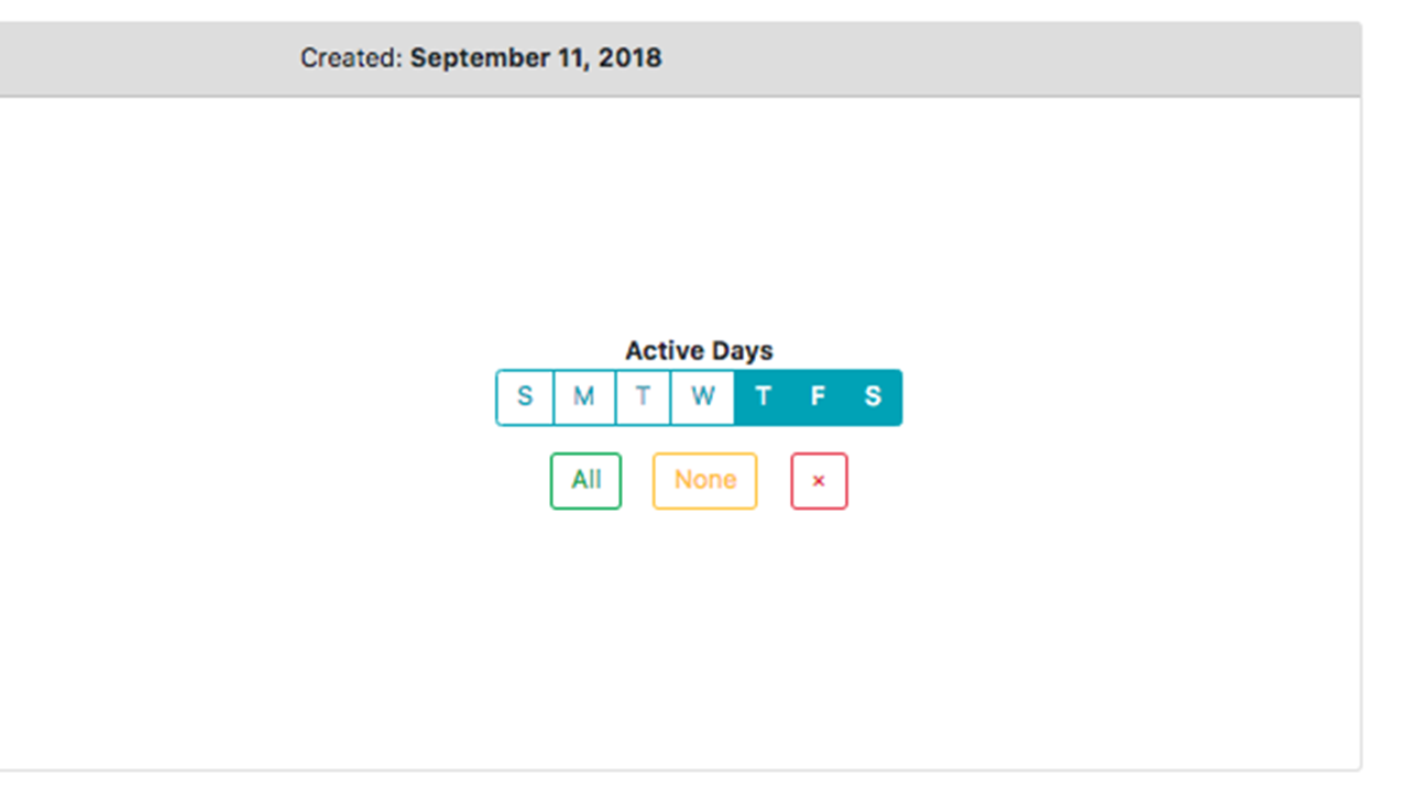
We decided to focus on ad scheduling and creation, with the ability to view subscription and venue information; and because the developer had some UI knowledge of his own, I focused on creating a usable layout on paper, which he would use as a foundation for Bootstrap elements.


